Charline Tyberghein Turns Everyday Objects Into Symbols
Charline Tyberghein (Antwerp, b.1993) paints enigmatic pictograms, like cards in a surrealist game whose rules remain obscure. With their trompe l’oeil effects, the results are visually striking, but also a little unsettling.
By her own account, Tyberghein had a difficult time at the Royal Academy of Fine Arts in Antwerp. She enrolled without a strong vocation to paint, and was sorely tested by the technical focus of the first two years. Asked to paint a still life or a model, she lacked the command of light and shade to bring feeling to her work, and the skill did not come with practice.
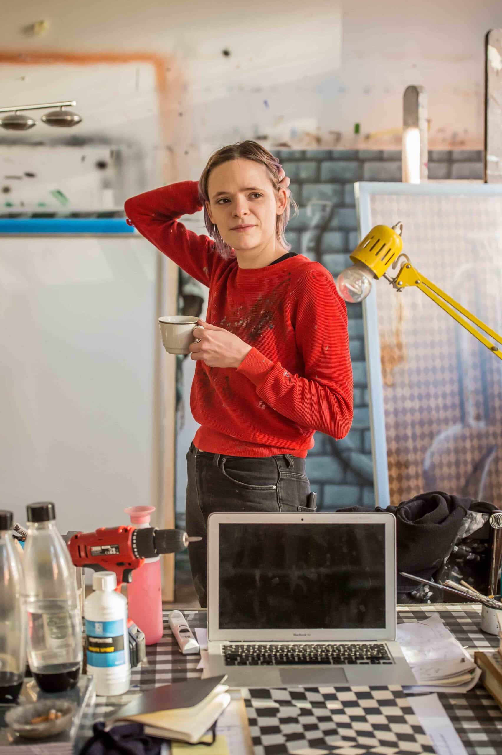 Charline Tyberghein
© Joost Joossen
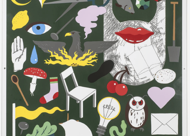
The frustration this provoked drove her to look for an alternative means of expressing herself. Painting straight lines was calming, and she started to explore patterns such as brickwork and wood grain. And instead of striving for a realistic or impressionistic rendering of objects, she distilled them down into their essential shapes: a standard fork, a universal hand, an eternal coat hanger.
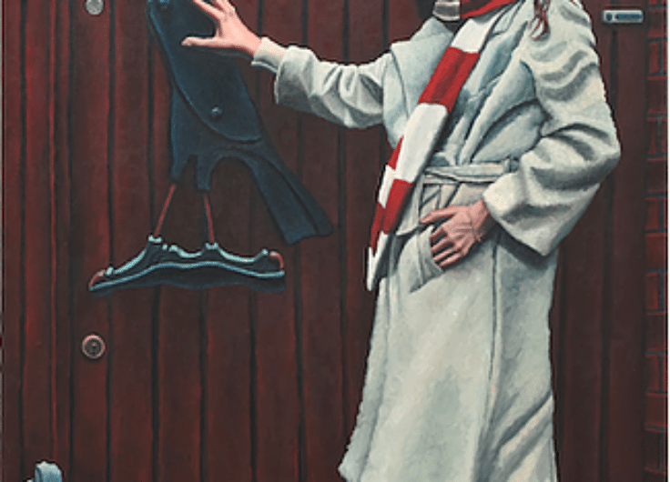
She took inspiration from the surrealists, in particular from René Magritte, who excelled at turning apples and bowler hats into symbols. But where the surrealists tended to place their objects in three-dimensional space — inside a room, outdoors, or in some dream landscape — the world that Tyberghein conceived was flatter. It is a place of planes and angles, of layers and depth. There is enough space to cast shadows, but no suggestion of a light source.
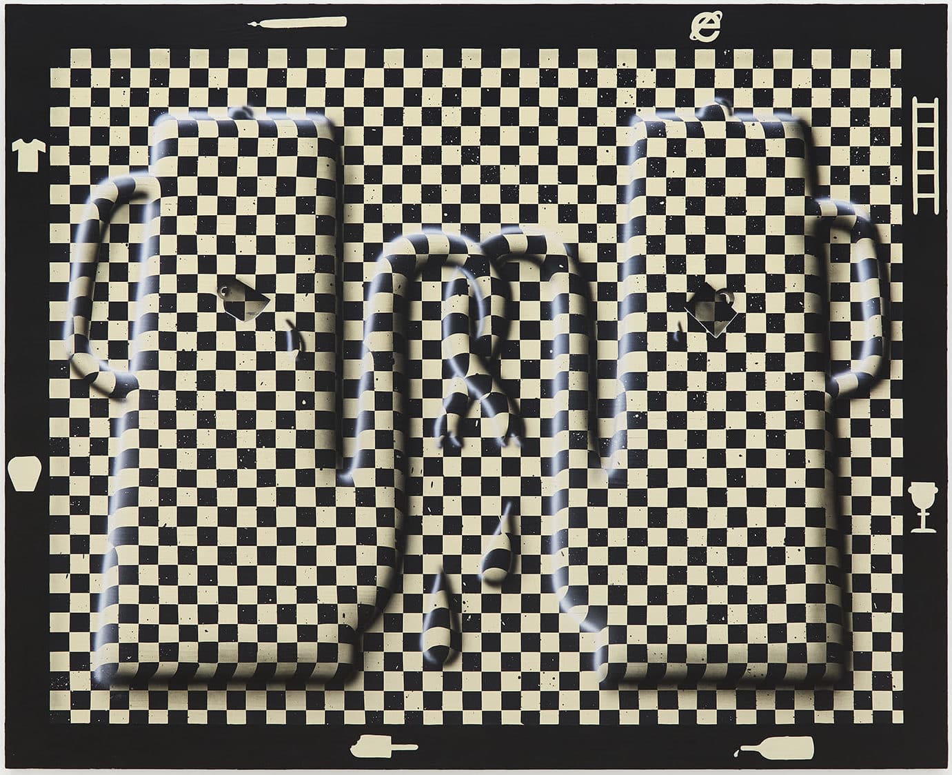 Double bluff, 2020
© Courtesy Gallery Sofie Van de Velde
Optical art pioneer Victor Vasarely was also an inspiration, but where he produced abstract geometries from grids and patterns, Tyberghein adapted his methods of distortion to represent objects. They appear to emerge from the material of her pictures, bending the lines of brickwork or the checked patterns of tablecloths.
Tyberghein won the Royal Society for the Encouragement of Fine Arts prize as best young painter in Europe
Having found her means of expression, Tyberghein was ready when the Academy’s programme changed from emphasising technique to demanding originality from its students. Since then, she hasn’t looked back. Shortly after graduating in 2018 she had her first solo show in Antwerp, and won the Royal Society for the Encouragement of Fine Arts (KoMASK) prize as best young painter in Europe. This award singled her out from masters students at 14 European art academies participating in the competition.
Further solo shows followed in 2019, in Antwerp and Brussels, and examples of her work were bought by the Flemish community and the prestigious Belfius collection. Group shows during 2020 took her work abroad, to Amsterdam and New York, and she currently has her first international solo exhibition at the Castor Gallery in London.
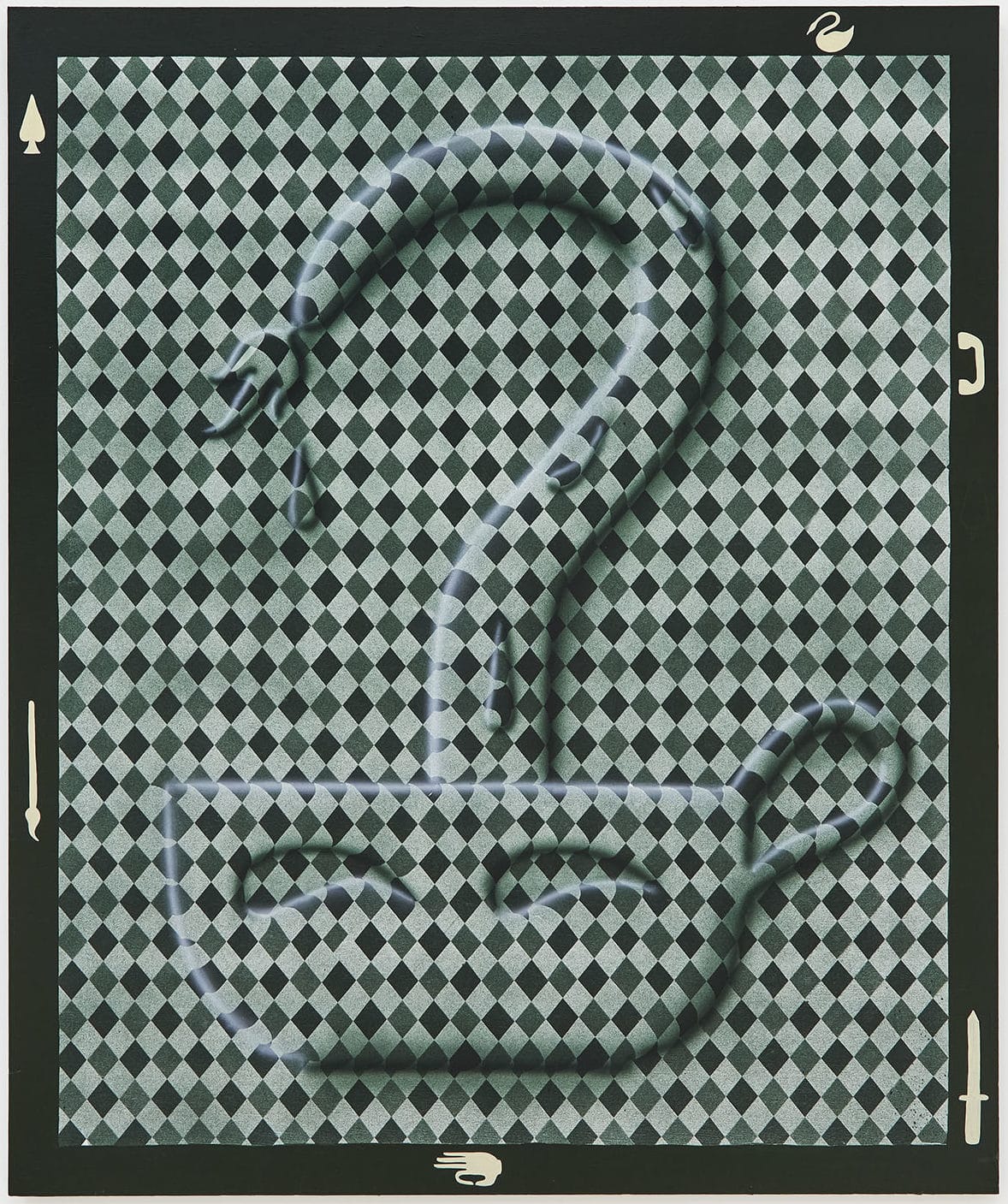 Faint chuckle, 2020
© Courtesy Gallery Sofie Van de Velde
At first, the excitement of her Academy breakthrough made her greedy, and she worked on a profusion of different symbols. But she soon learned the value of limiting her range, developing a recurrent alphabet of symbols that recur alone or in different combinations.
Her process begins with an archive of pictures clipped from magazines, copied from books or saved from the internet. These images are grouped thematically, so that all the hands, for example, are together, regardless of whether they come from art history, heraldry, road signs or advertisements.
She then works on each category, distilling down until she finds her ideal form for hand, knife, pretzel, fork, candle, swan, and so on. Each symbol is painted onto a small wood panel, which serves as a reference point for the larger paintings that follow.
The patterns in these paintings are created with masking tape and acrylic paint, sprayed on or applied with an airbrush. While this requires precision, Tyberghein is also happy to leave behind imperfections, such as flecks of pigment or marks where masking tape has been removed a little too soon for the drying paint. These traces of the artist’s hand are a reminder these are personal rather than programmed images.
 Better Not, 2018
© Courtesy Gallery Sofie Van de Velde
The concept of an alphabet is also useful in understanding the way Tyberghein deploys her symbols. In early interviews she described how they had specific personal meanings: brickwork represented calm, while cigarettes represented her breaks from work. Placed together in the same painting, such as Better Not
(2018), they make a kind of self-portrait.
More recently she has avoided talking about personal meanings, saying that the symbols have increasingly taken on an independent existence. This is also the way the viewer experiences them: they seem significant because of the forceful way they are painted, and because they recur and recombine. But exactly what they mean is mysterious, open to interpretation.
They also carry a surprisingly strong emotional charge. Sometimes this is in the form she chooses, either emphasising a natural shape — as in the neck of her swan — or softening usually rigid objects, either by casting their shadows over other shapes, or simply by having them wilt or wrap around one another. Rather than Dali’s melting watches, this brings to mind Claes Oldenburg’s soft sculptures, and she sometimes cites Pop Art as another inspiration.
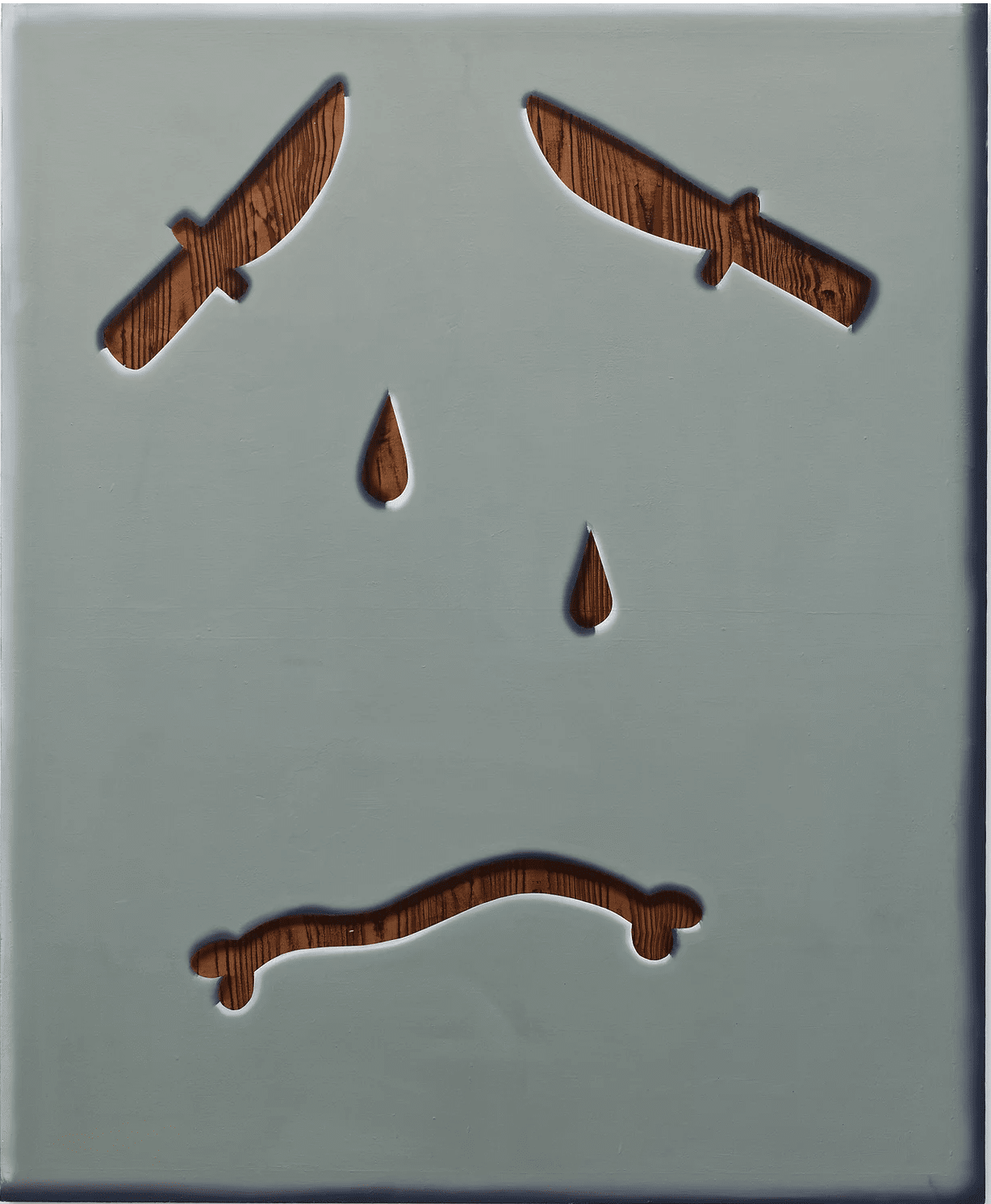 Woe is Me!, 2019
© Courtesy Gallery Sofie Van de Velde
Often the dominant emotion of Tyberghein’s paintings is pathos or melancholy, a result of the intense focus on mundane objects and their isolation in geometrical space. This is something she tries to rebalance with a choice of colour that pushes the emotional register in the opposite direction, or a title that subverts the mood. For example, Woe is Me! (2019) tells the viewer not to take too seriously the sadness of a face made up of knives, teardrops and a comically soft bone, all cut out of a white foreground to reveal a wood grain underneath.
The human face is perhaps the only object that has resisted Tyberghein’s efforts to find a symbolic essence. She often returns to it, but always by combining separate elements rather than creating a unified symbol: Eager Edith (2019), for example, makes a face by arranging pencils and pencil stubs on a plain background, while Hide Away (2019) forms eyes and a mouth by bending the horizontal white lines of a venetian blind.
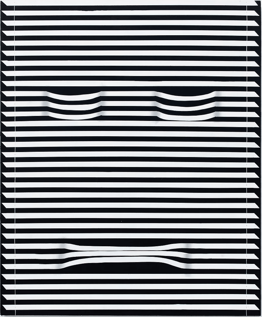
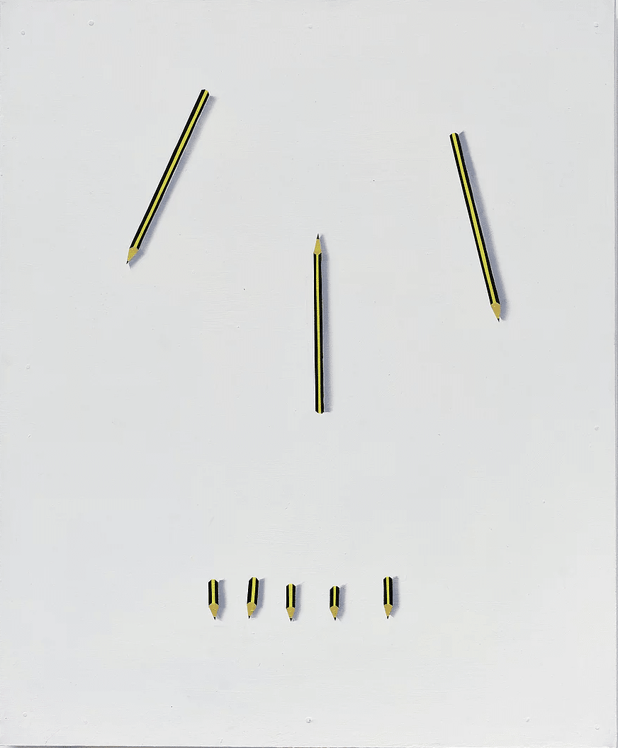 Hide Away / Eager Edith, 2019
© Courtesy Gallery Sofie Van de Velde
The interplay of symbols is also reflected in how Tyberghein displays her work. The 2019 solo show Soft News, at Beursschouwburg in Brussels, arranged four double-sided paintings around a table, putting the symbol-characters in conversation. Salt shakers, pretzels, wine glasses, sausages, and forks emerge in relief from tablecloth patterns, while the table in the centre was painted with wood grain, its surface scattered with painted cigarettes. It could be a dinner party or a break-up, depending on how you want to look at it, Tyberghein said.
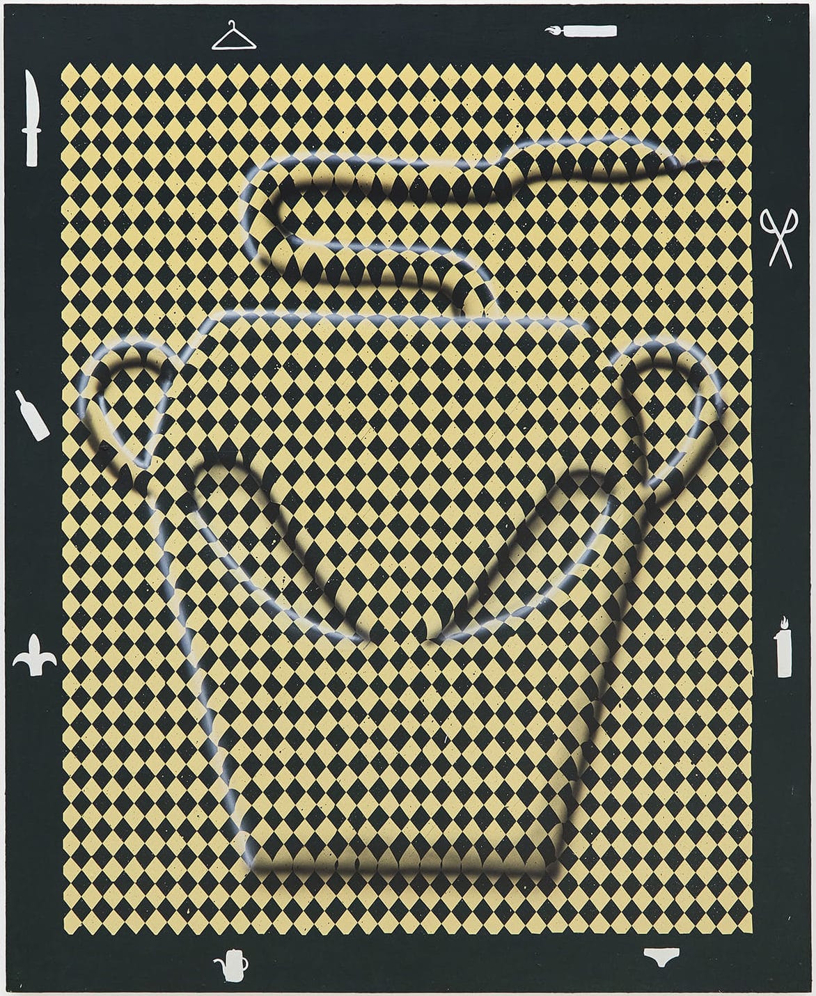 Rise and grind, 2020
© Courtesy Gallery Sofie Van de Velde
This interplay is present in a different way in her London solo show, called Many Drops Make A Puddle. The paintings feature domestic containers — jugs, jars and tankards — emerging from tightly packed check or diamond patterns. Many are dripping or spilling drops, so that the drop becomes a symbol in its own right alongside the other objects. Are these drops in the ordinary sense, or tears? Once again there is a possible melancholy, but a warmth to the colours — honey browns and midnight blues — that pulls in the opposite direction.
Meanwhile the borders of the paintings are decorated with smaller icons, both in the sense of symbols and the suggestion of a computer interface. Some of these are familiar from the repertoire of her large images — hands, knives, pretzels, swans — while other symbols are new, or boldly borrowed, such as the Internet Explorer logo.
It would be a mistake to see these as keys to unlock the meaning of the paintings. Rather they are another twist in Tyberghein’s playfulness, part of a visual universe where laughing and crying co-exist, and where meaning and mystery jostle for our attention.
Many Drops Make A Puddle is at the Castor Gallery, London, until 13 March 2021


