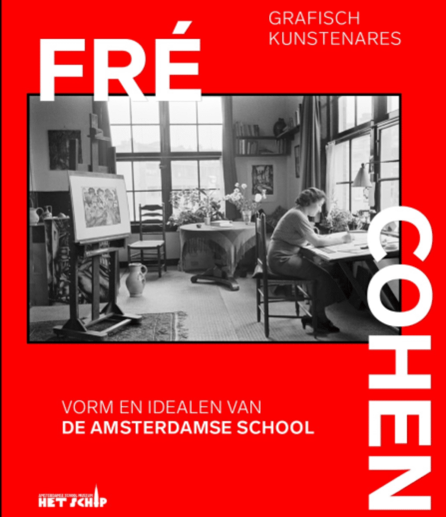
Graphic Artist Fré Cohen: A Free Woman of Many Styles
Graphic artists have rarely received much attention in the Low Countries. The exhibition about Fré Cohen (1903-1943) in Amsterdam’s Het Schip Museum and the accompanying publications are a welcome addition to well-known art history. Cohen’s life story in turbulent times and her free play with styles appeal to the imagination.
Art history has long been the history of architecture and sculpture and painting. It is only in recent decades that this limited view has been progressively broadened. Disciplines that were considered to belong to the so-called “applied arts” are taken more seriously and increasingly regarded as full-fledged artistic expressions and studied as such. Design, fashion, and illustration are just three examples. A fourth is graphic design. The fact that a book and an exhibition describe the Amsterdam Fré Cohen (1903-1943) as a “graphic artist” illustrates this appreciation of the applied arts. Both are initiatives of Het Schip, the Amsterdam School Museum in the city on the Amstel River.
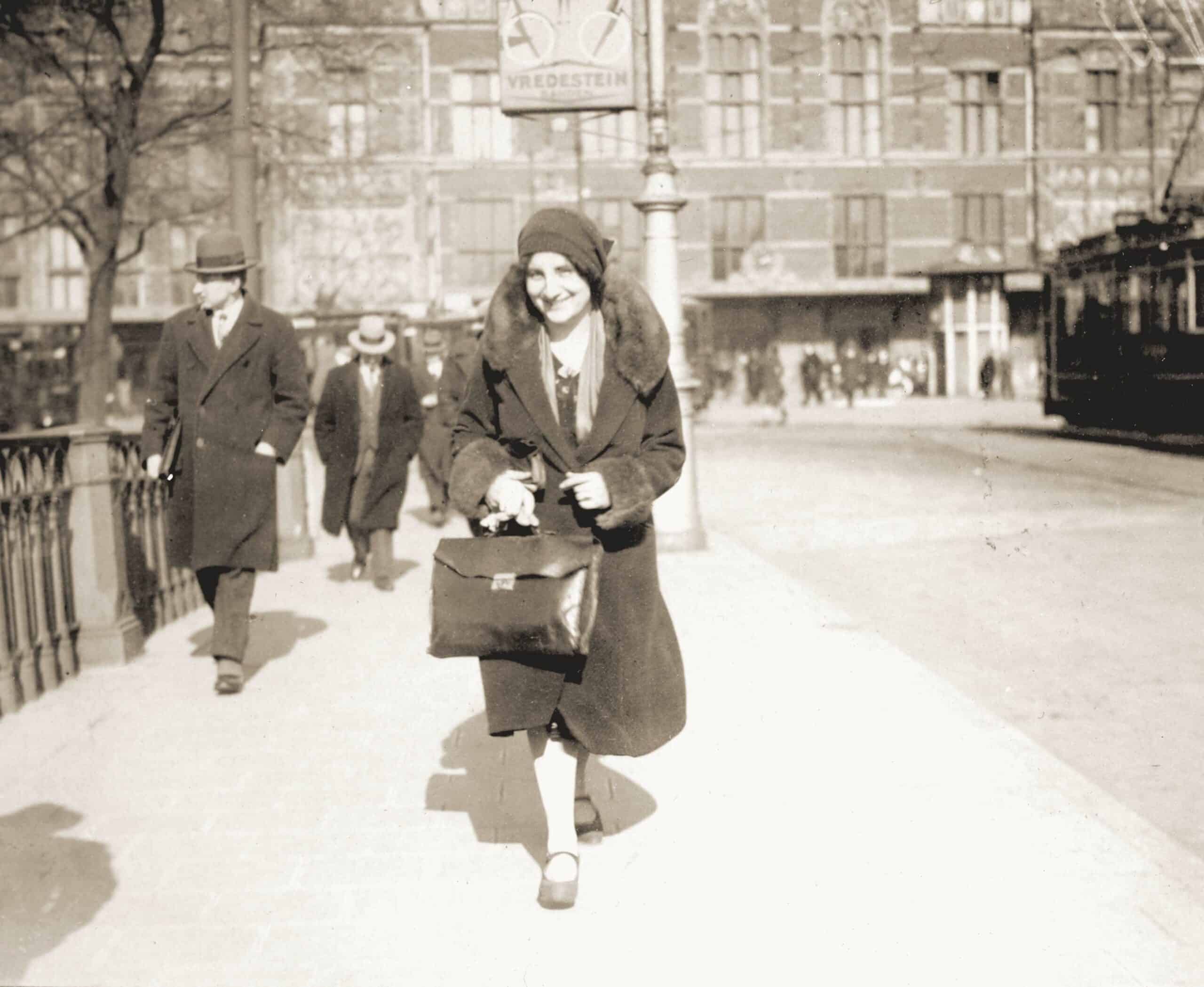 Fré Cohen in front of Central Station in Amsterdam
© Museum Het Schip, Amsterdam
Another tendency in recent art history is to look for female practitioners of art. While this movement in the historiography of the “autonomous” arts has gained momentum in recent years, it is only just beginning to reach cruising speed in the history of graphic design. The renewed interest in Fré Cohen – short for Frederika – is one of the first expressions of this in the Low Countries. As a female designer, she was exceptional at a time when the world of printing, typography, illustration, and design was still very much a masculine domain. Not only that world, by the way: universal women’s suffrage was only introduced in the Netherlands in 1919. Fré Cohen was sixteen at the time.
She grew up in a family of Jewish diamond workers. Her father, Levie or Louis, worked as a brilliant cutter, and her mother had other tasks in the same industry. They earned just enough to be able to make ends meet, but there was always too little money rather than too much. When things went badly for the Amsterdam diamond industry, the family even moved to Antwerp for a few years, where Louis could get a job more easily. They lived in Berchem for about four years, after which father could get back to work in Amsterdam.
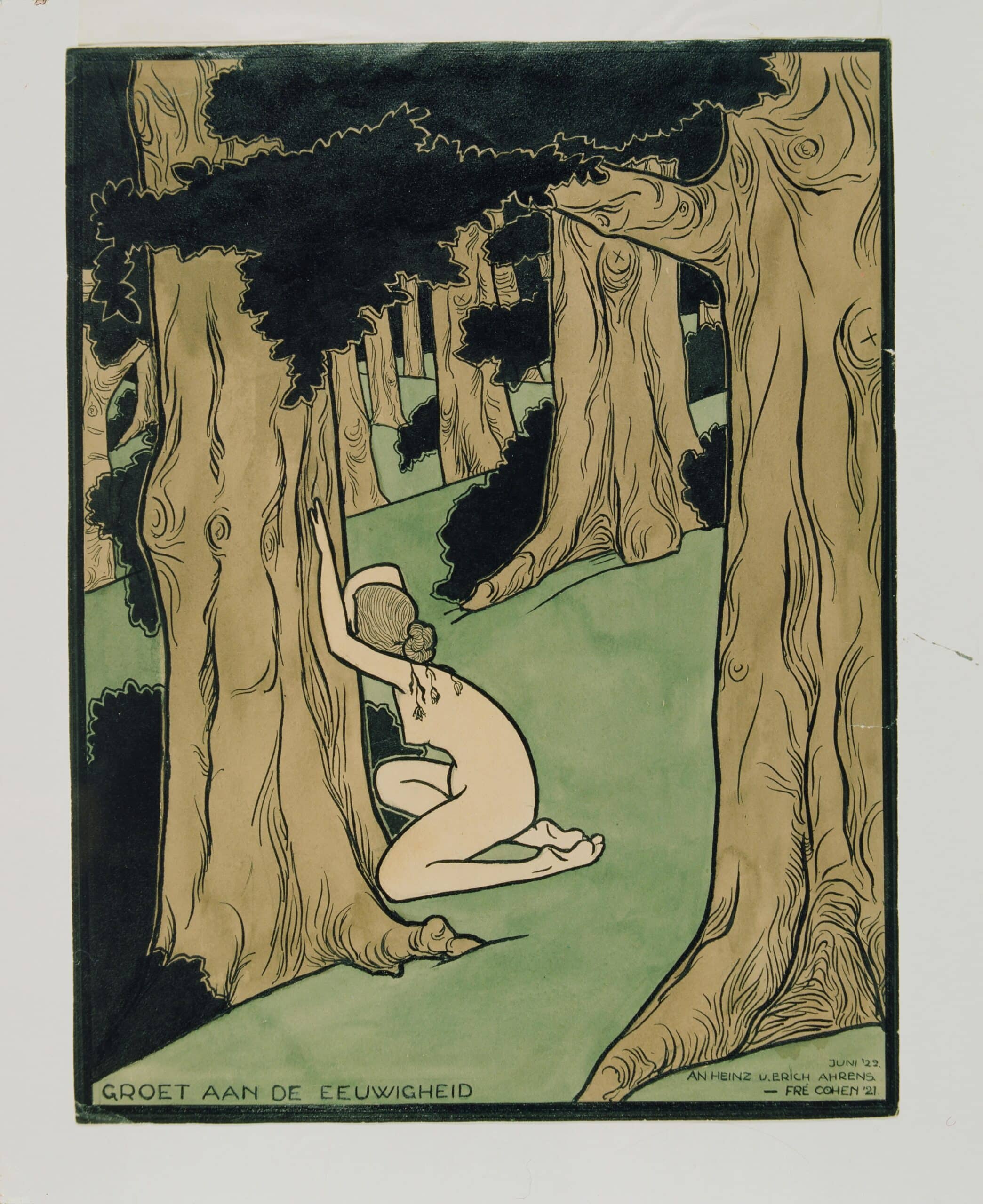 One of Fré Cohen's first designs, made with India ink and watercolour.
Little Fré did very well in primary school. Her parents had saved enough to let her continue her education: she was allowed to go to the mulo (a Dutch acronym for more extensive primary education). Studying for three more years: that was unprecedented. But then it was over: she had to start earning money to help support the family. During her school days, she came into contact with the Workers Youth Central (AJC), the youth wing of the Social Democratic Workers Party (SDAP), of which she soon became a member – her parents also had socialist sympathies. This step would define the rest of her career and her life. Not only did she make many lifelong friends, but she also had the opportunity to design all kinds of printed matter and later netted numerous commissions through people she knew from these surroundings.
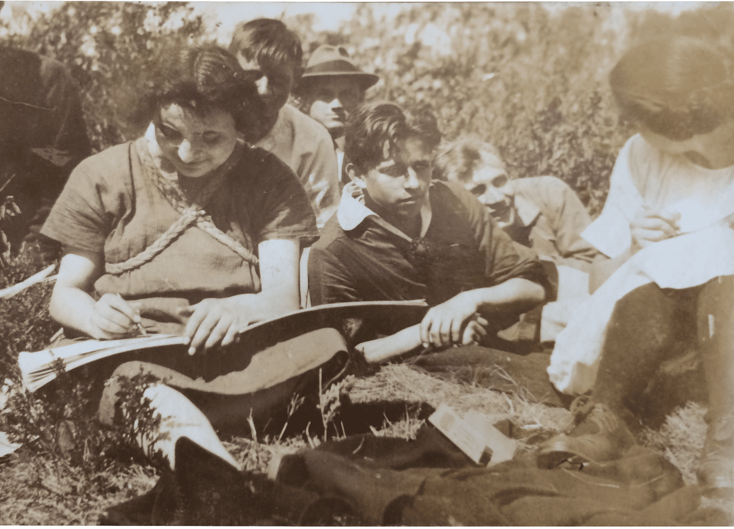 Fré Cohen at work with colleagues.
© Museum Het Schip, Amsterdam
Cohen’s creative talent was first called upon at her second job. She liked to draw, and at DRAKA, the Dutch Wire and Cable Factory in Amsterdam North -, she was asked to design advertisements and printed matter. Fré liked it so much that with the money she earned with her job she enrolled in an art school, first at the Graphic School and from 1924 at the Institute for Applied Arts Education. In the meantime, she became known for her design talent, and she exchanged her job at DRAKA for a job at NV Ontwikkeling, the SDAP-affiliated publishing house that would merge into De Arbeiderspers (Worker’s Press) in 1929. She designed dozens of books, book covers and brochures for that publisher often illustrated with woodcuts in black and red. Stylistically, they are clearly related to the 1920s, although they sometimes seem more akin to historicizing forms with many decorative elements of their own, and sometimes to more geometric modernism. A combination of both (decorative typography, geometric interplay of lines), can be found, for example, on the cover of Hendrik de Man’s 1928 AJC edition of Het sosialisme als kultuurbeweging. (Socialism as a Cultural Movement).
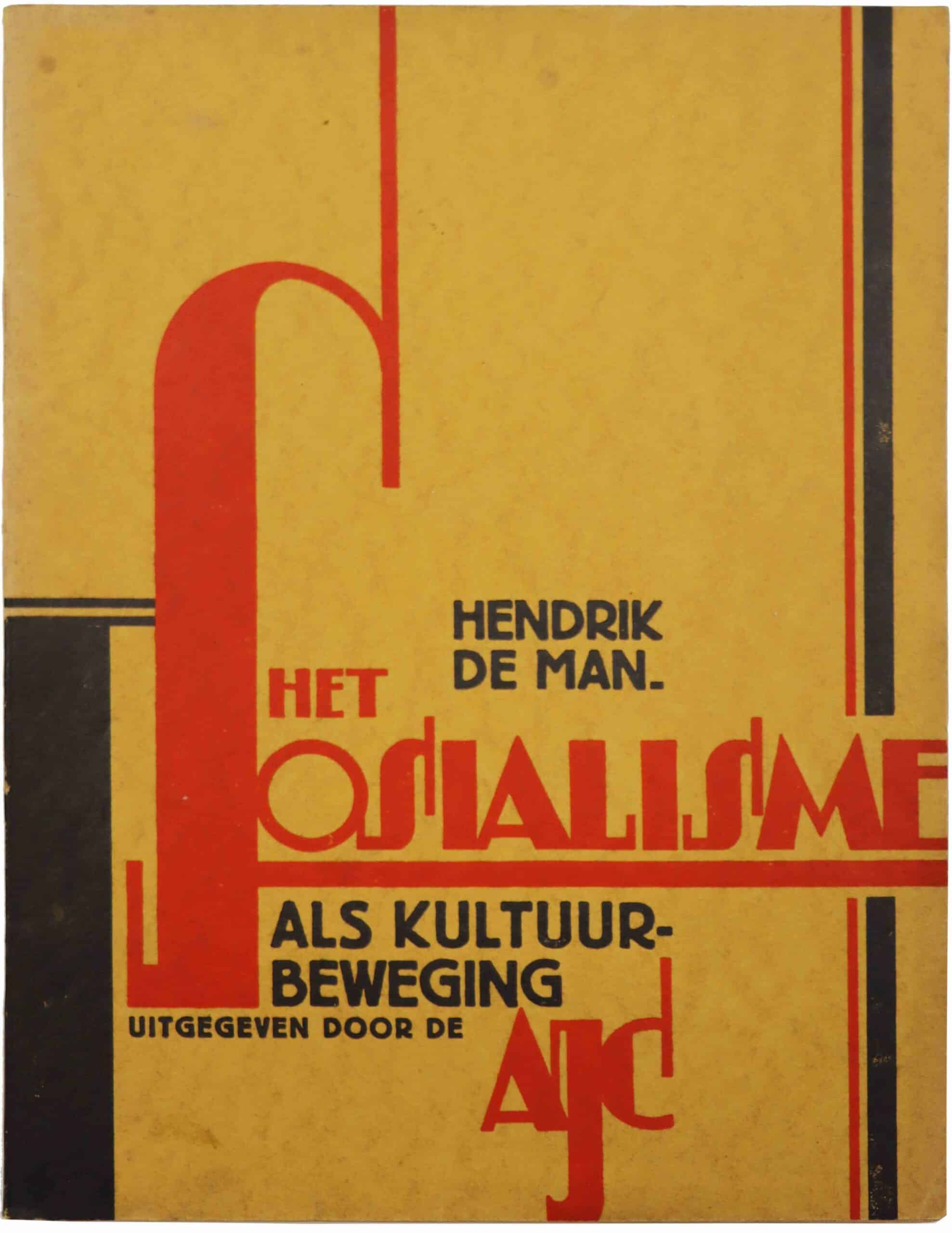 Het sosialisme als kultuurbeweging. (Socialism as a Cultural Movement)
© Museum Het Schip, Amsterdam
Cohen made her most widely distributed designs in the period 1929-1932. At that time, she was employed by the city printing company of the Municipality of Amsterdam, where she designed municipal printed matter. Calendars, certificates, administrative guides, yes, even Giro bank books were given the bold graphic treatment, characterized by block and line motifs, that closely aligned with the architecture of the Amsterdam School. When she then started working as an independent designer for the widest range of clients, from socialist organizations to Jewish associations, from industrial companies to theatres, she was able to use styles and techniques much more freely. At school she had not only become proficient in woodcutting, but also in stone printing or lithography, and in addition, she herself sometimes ventured into making the occasional calligraphic drawing or watercolour.
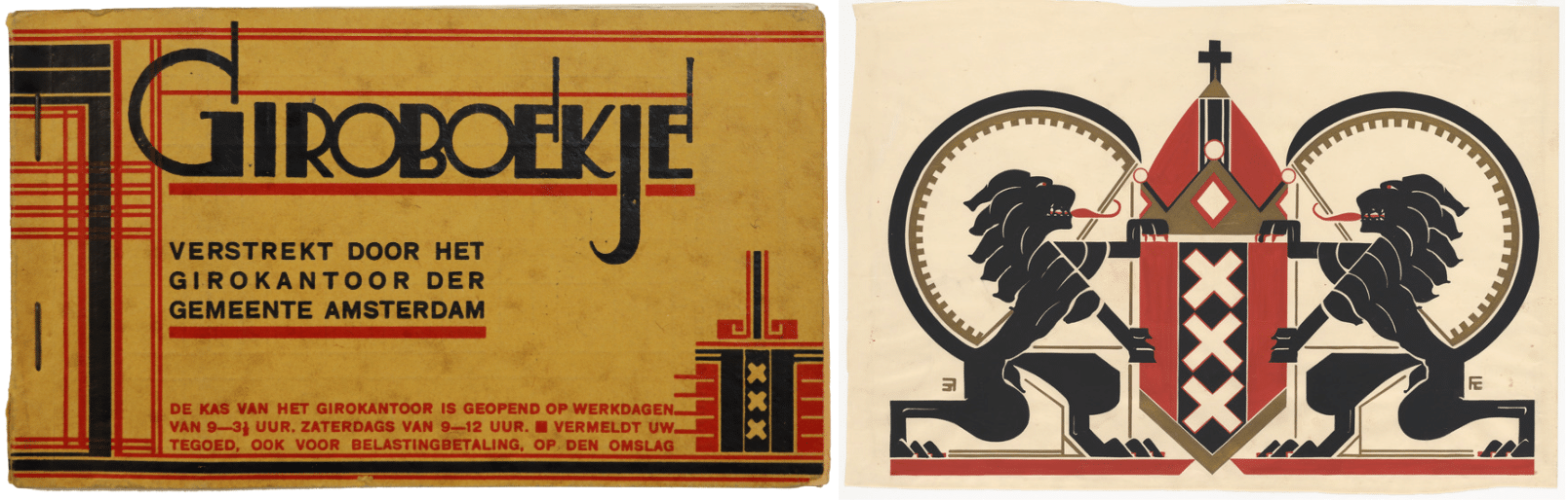 Cohen made her most widely distributed designs in the period 1929-1932. At that time, she was employed by the city printing company of the Municipality of Amsterdam, where she designed municipal printed matter.
© Museum Het Schip, Amsterdam
The bookplates she made for various friends and contacts were a hit. The highly successful woodcut she made for the books of actress Marie Hamel received an honourable mention from The Book Plate Association in Los Angeles in 1932. But it is mainly in her book covers that she can indulge in numerous stylistic idioms, from the all-too-sober Prutske by Stijn Streuvels (1930) to the romantic Broadway
by Vicki Baum (ca. 1939) and the new objective, all-business-like Manual for the Use of the Electric Stove (1931). She no longer only works for De Arbeiderspers, but for the other Dutch publishers Wereldbibliotheek and Querido as well. Moreover, she also occasionally writes herself: her report of a stay in the Swiss “artists village” Ascona, which appeared in a magazine in 1936, interspersed with her own drawings, recalls the cheerful texts with which she described holiday camps twenty years earlier in the AJC’s member magazine.
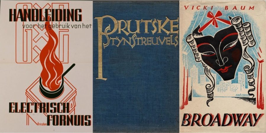 It is mainly in her book covers that Cohen can indulge in numerous stylistic idioms.
© Museum Het Schip, Amsterdam
But on the political front, these are turbulent times, and what is happening in Germany is also seeping through to the Netherlands, even literally: many Jews are fleeing Hitler’s country and landing in the Netherlands. It awakens Cohen’s awareness of being Jewish, who had already been brought up at home with a great sense of social compassion. She increasingly designs and offers her services to Jewish associations, where she meets writer and Jewish journalist Joseph Gompers (1899-1945), who becomes a close friend. For him, she makes two ex-LIBRIS’s.
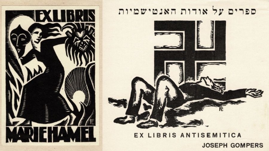 The bookplates she made for various friends and contacts were a hit.
© Museum Het Schip, Amsterdam
One of them is a hallucinatory historical image: a woodcut of a swastika with a dead man underneath. The text reads: Ex libris antisemitica. It was used in the anti-Semitic books that were in Gompers’s library. In the Second World War, of course, things did not get any better for the Jews in the Netherlands. There is a photo of Cohen with colleagues from the School of Applied Arts that clearly shows the Star of David on her lapel. Shortly after that photo, she went into hiding in Twente, in the village of Borne. On June 9, 1943, she was found there by the Hengelo Jew Hunter Frankevoort. Fré Cohen took a poison pill and died three days later in hospital: just shy of turning forty, but free until the end.
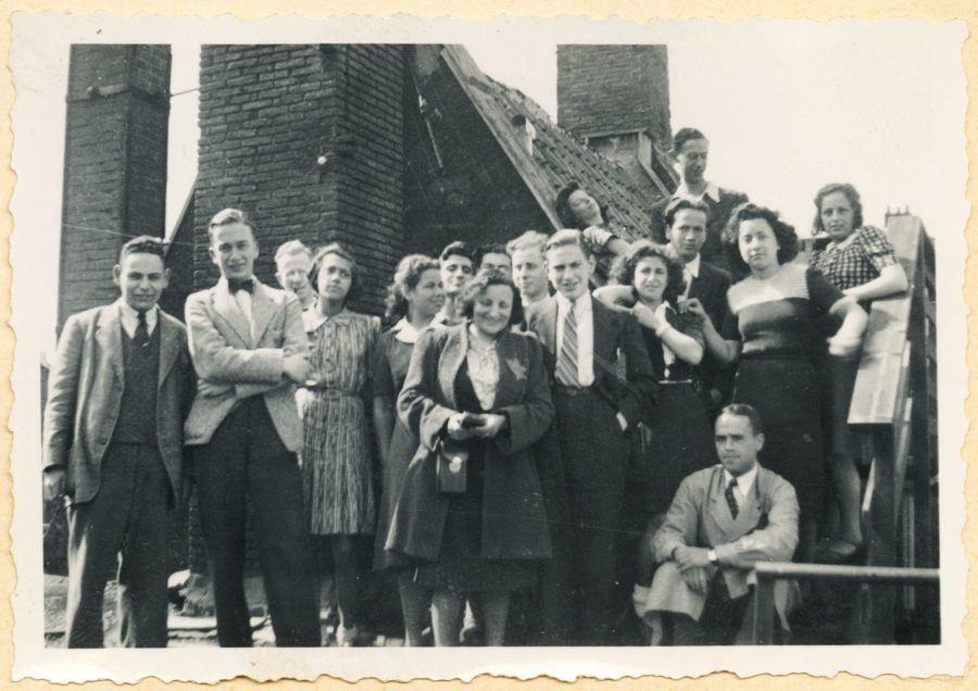 Fré Cohen (in the middle, with Star of David) with staff and students of the School of Arts and Crafts, circa 1942.
© Joods Historisch Museum, Amsterdam
Cohen’s life story appeals to the imagination. But a lot of sources no longer exist. Perhaps that is why Edith Brouwer chose to publish a “novel about the life of Fré Cohen” to go with the exhibition in Het Schip. It turns out to be a somewhat unfortunate book: not only is it a rather wooden and incomplete processing of a limited number of sources, the boyhood adventure-like story is also far too flat to be able to speak of a novel. Then again it is probably suitable as a children’s book to get children and young people acquainted with a historical figure whose life forms the basis of many starting points with political, artistic – and city history.
Because what also stands out in the exhibition catalogue is the strong emphasis on the immediate Amsterdam context in which Fré Cohen worked and lived. This is of course important, but what remains virtually unanswered in both the exhibition and book itself is the question of the place she occupies in the context of the international developments in the (applied) arts of that time. That is a pity, because the artistic significance of the work of this free woman of many styles is overly reduced to the local level. Whilst in international terms Fré Cohen must also have been one of the earliest known female designers, and her design language clearly shows how in the 1920s and 30s countless expressions of the “new” were being sought, while the old was not yet completely dead.
Fré Cohen: vorm en idealen van de Amsterdamse School, until 30 October 2022 in Museum Het Schip, Amsterdam